

VI・Sign design
2020
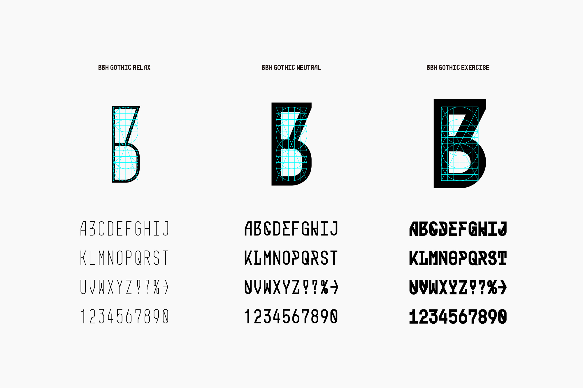
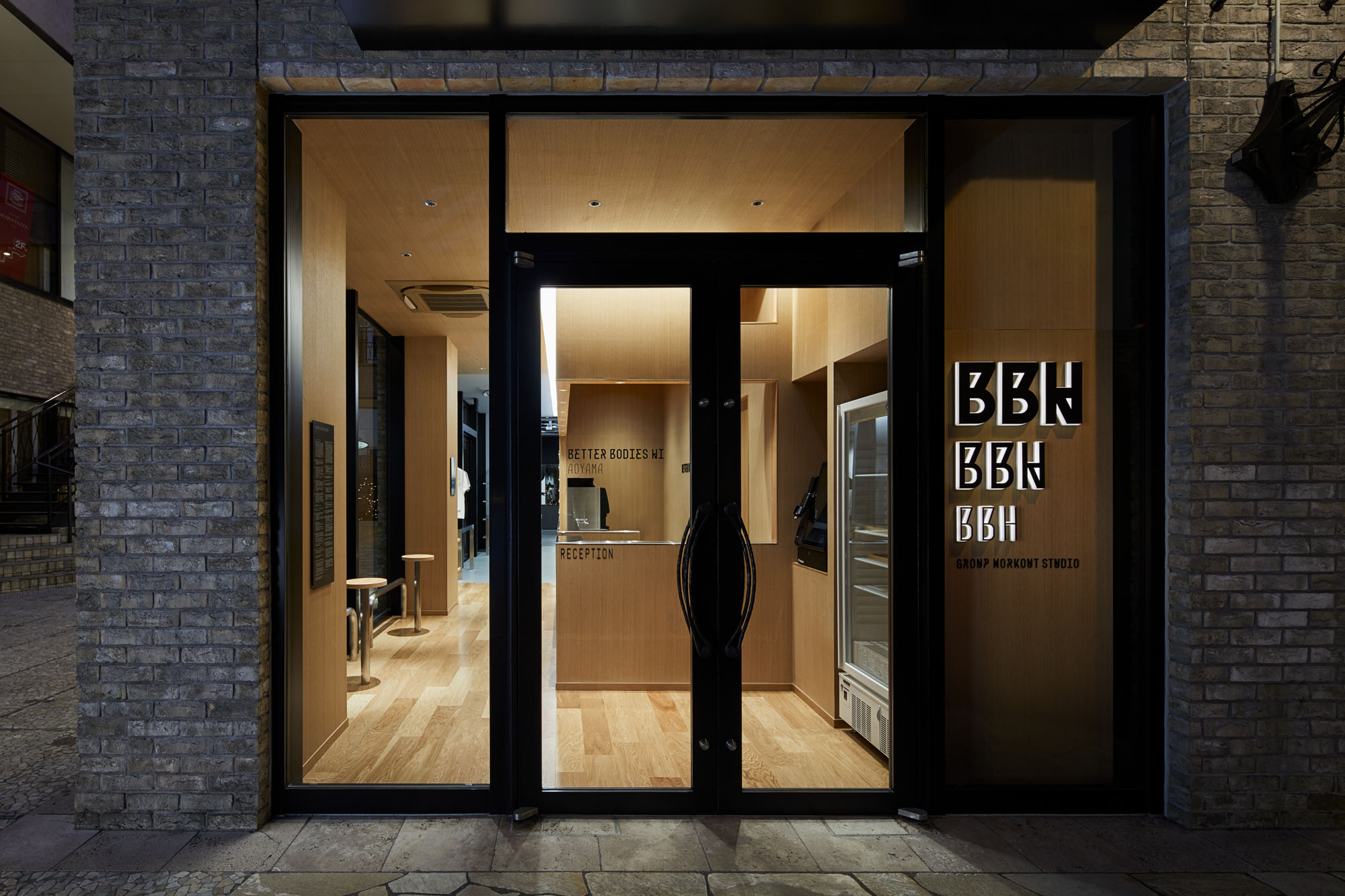
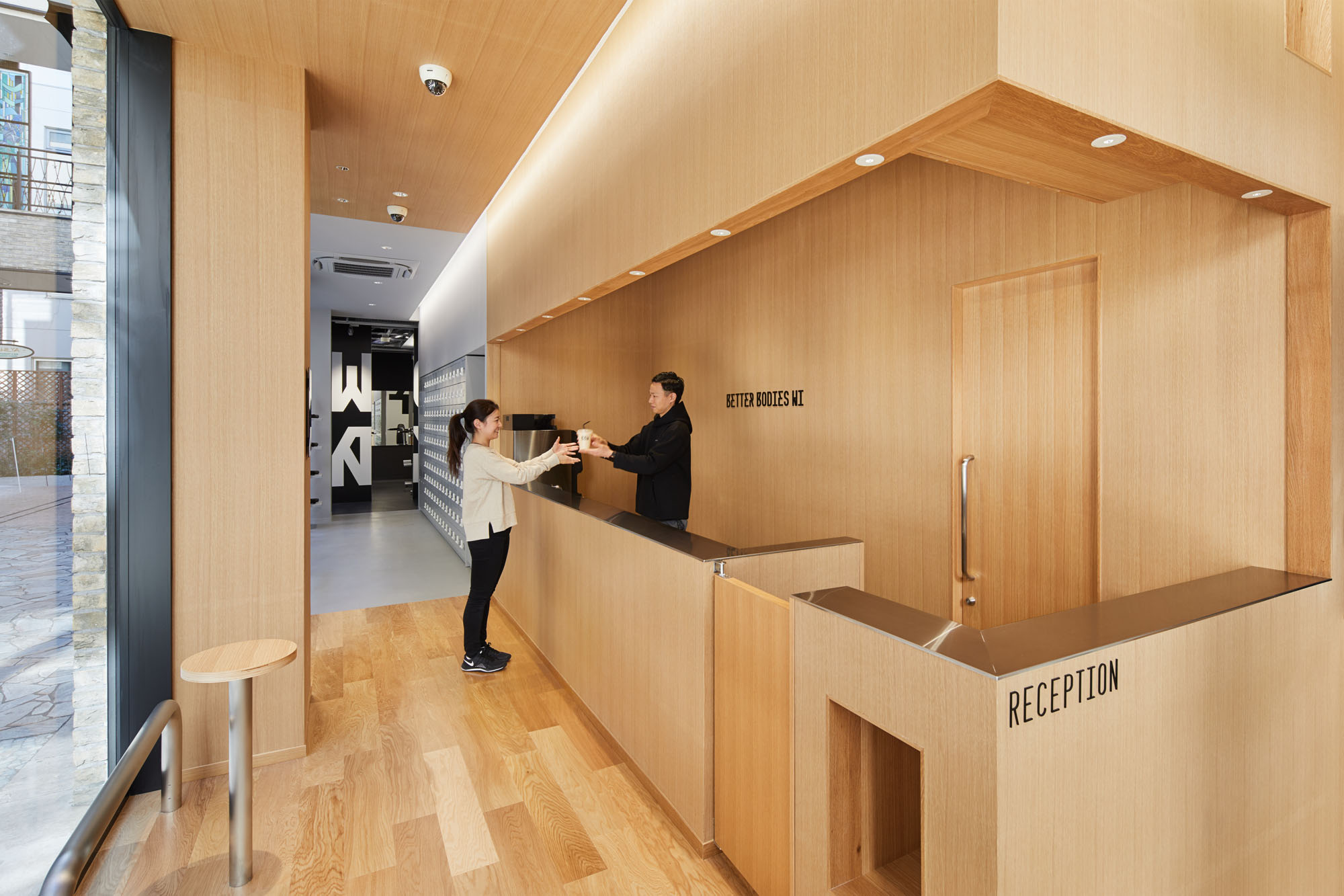
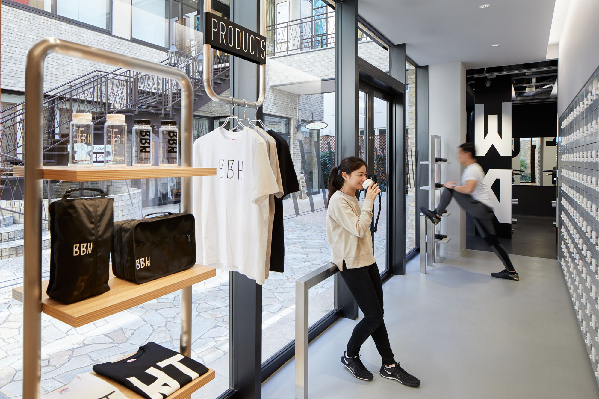
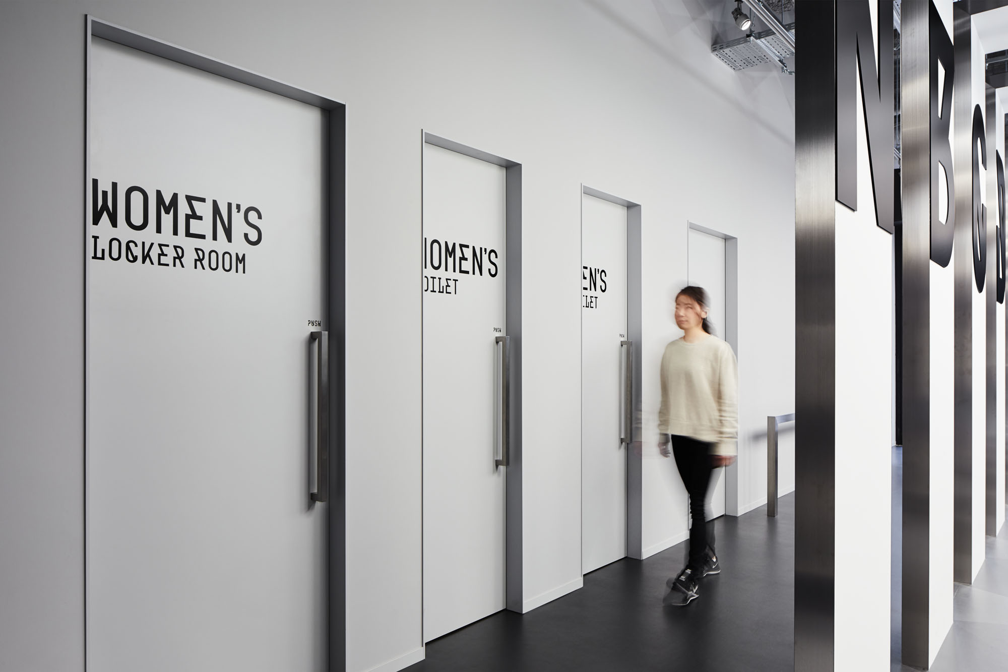
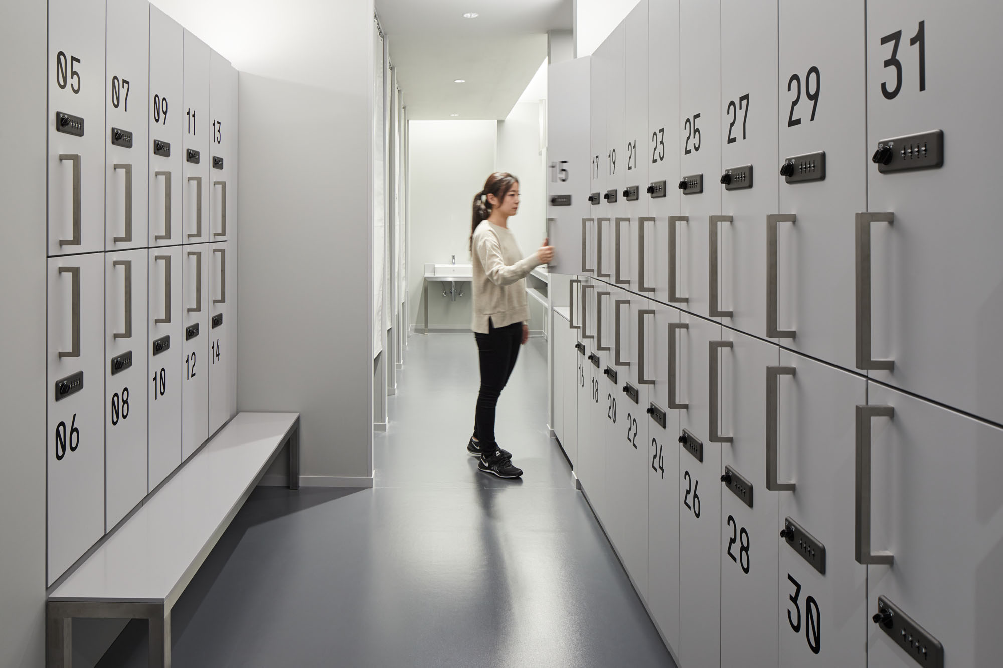
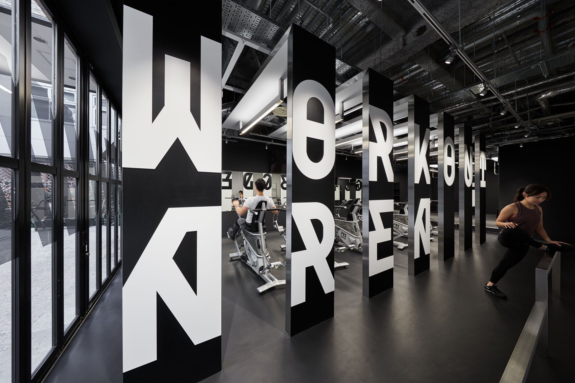
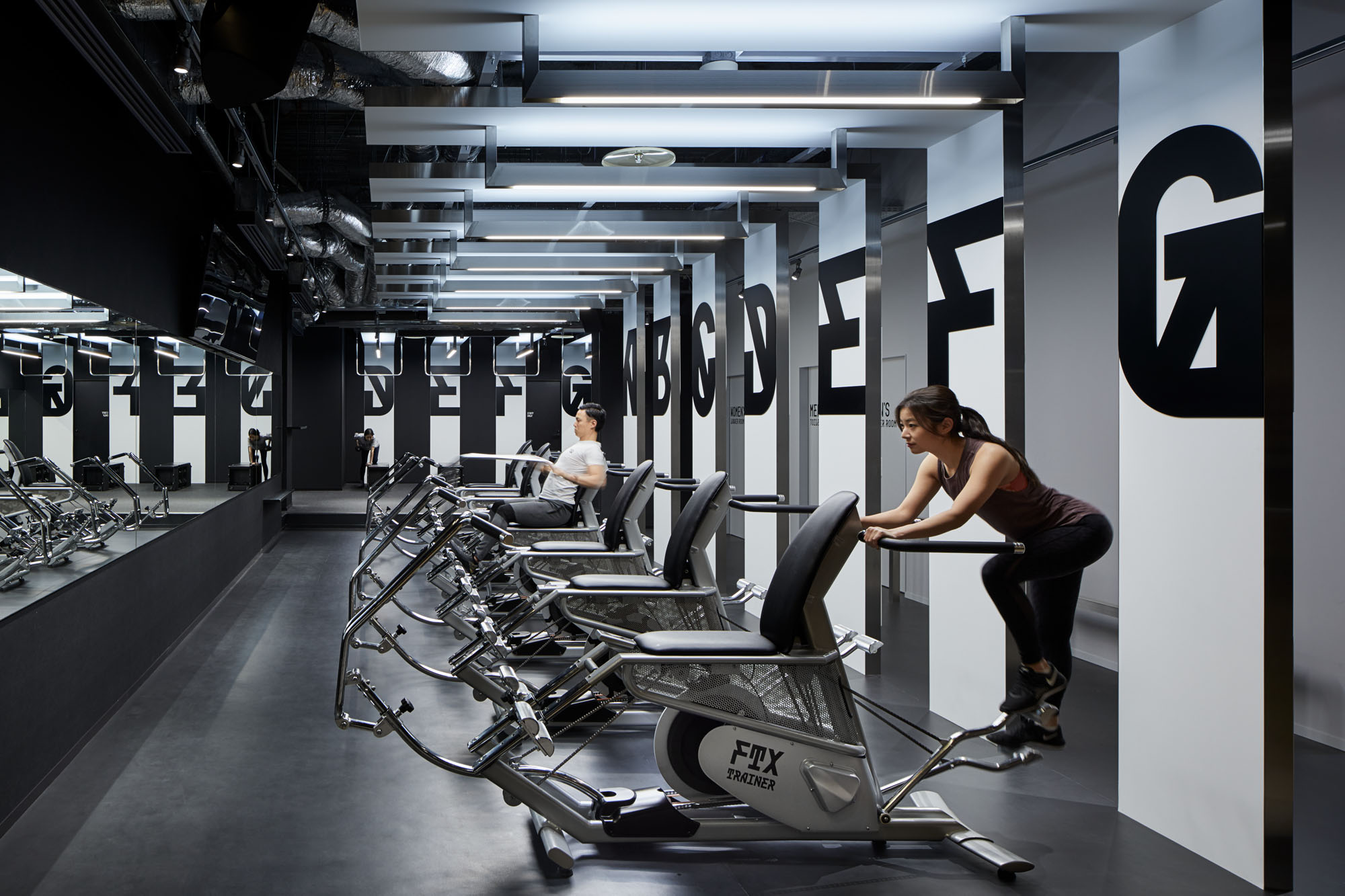
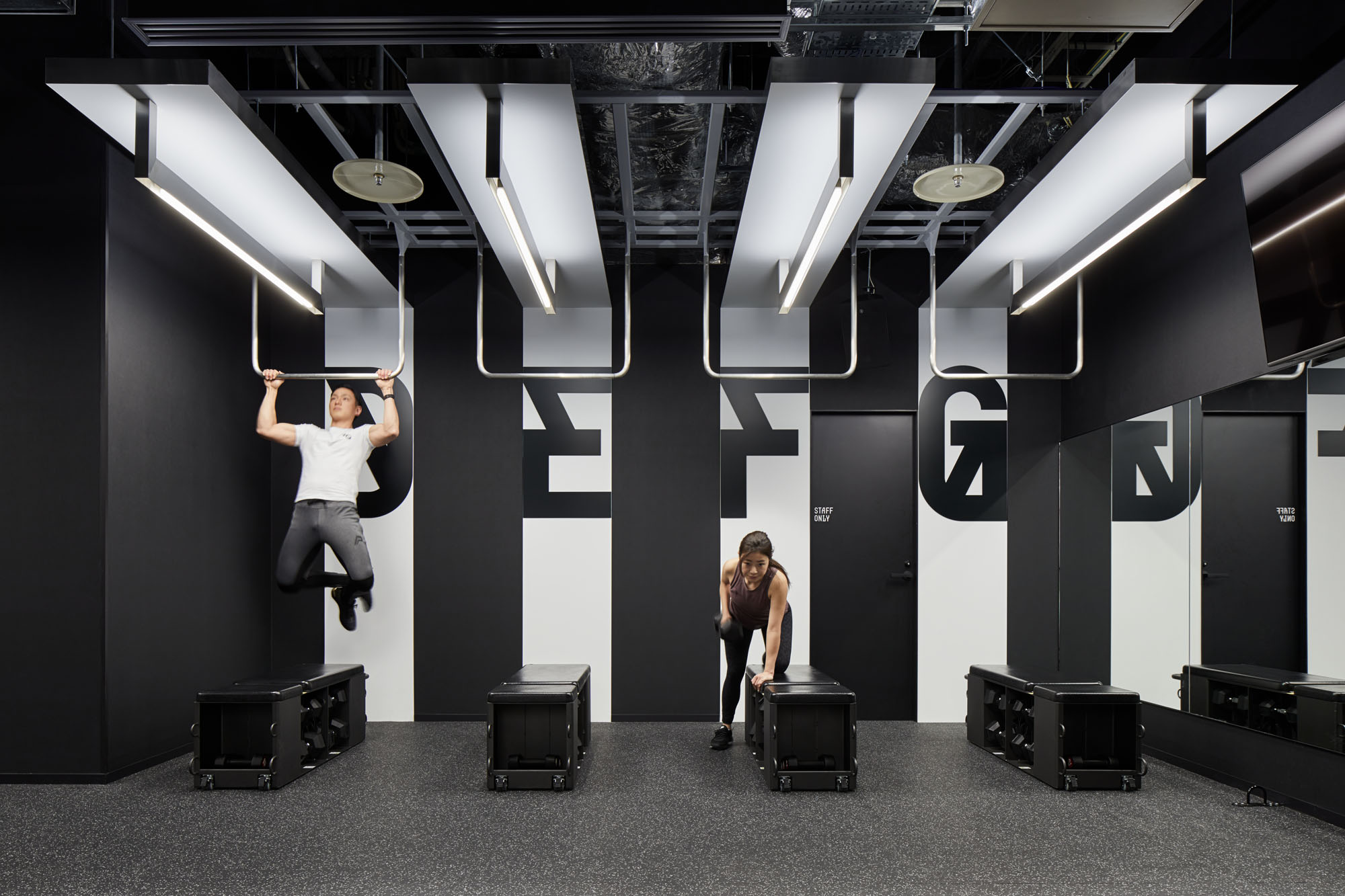
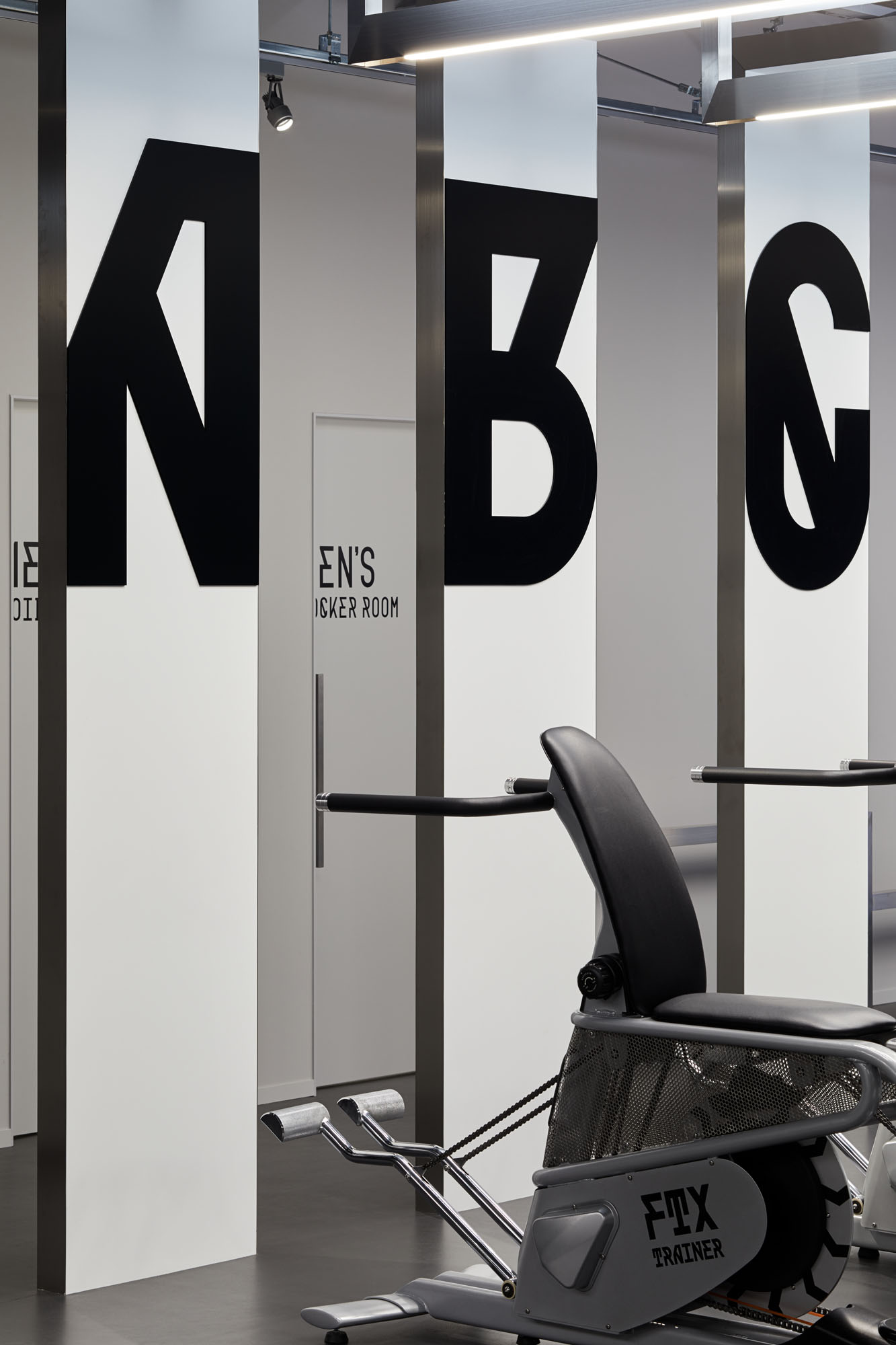
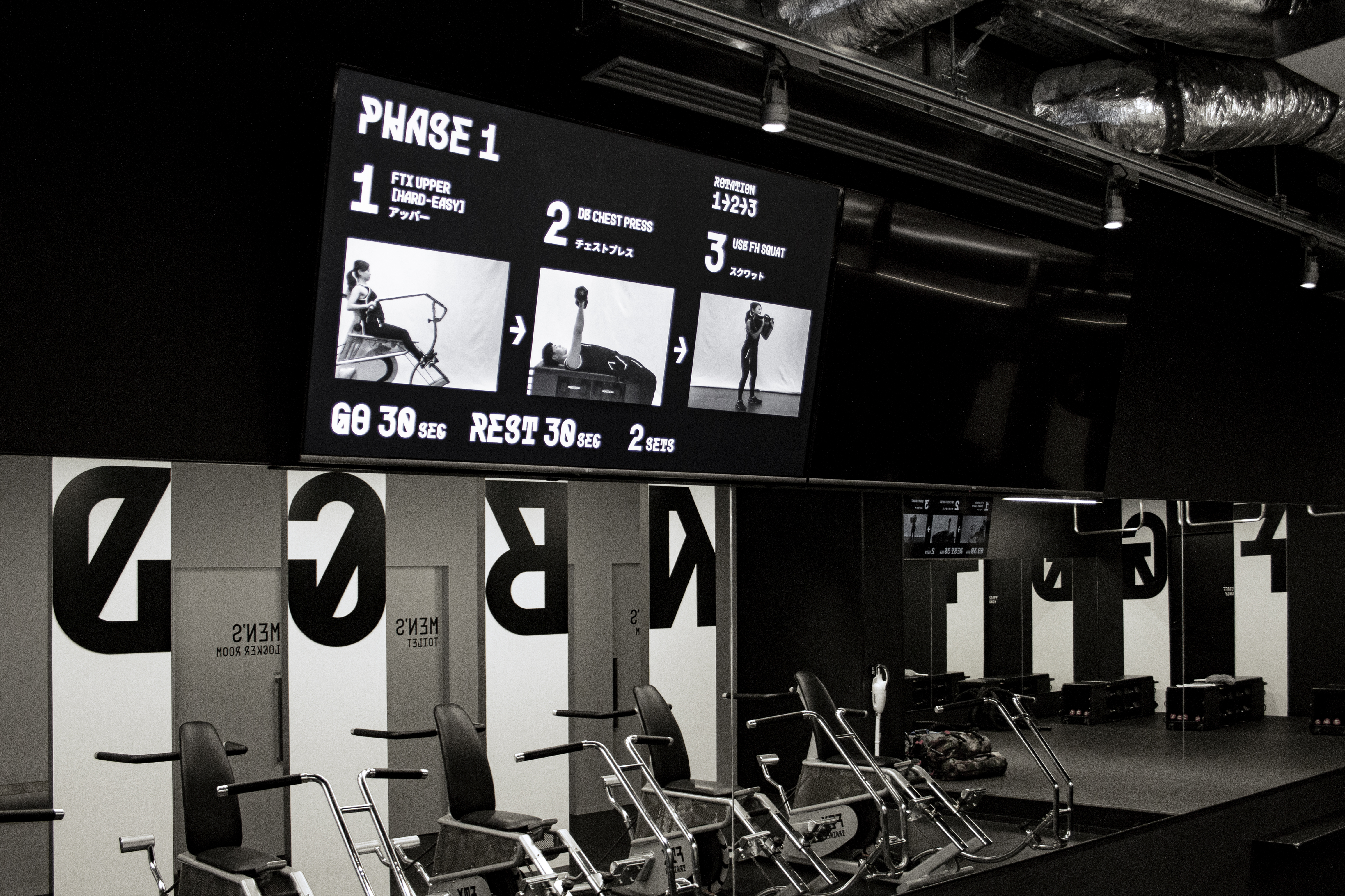
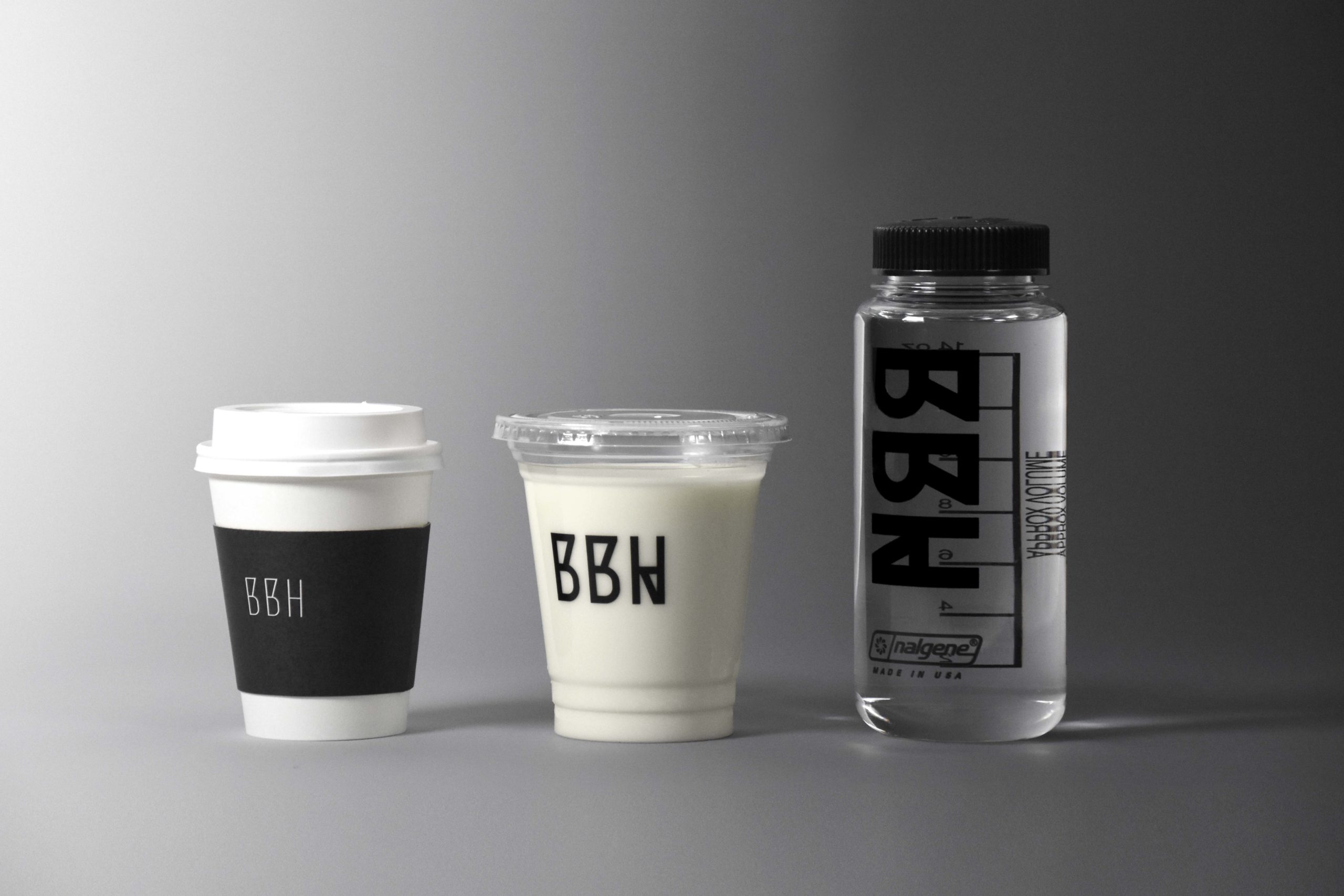
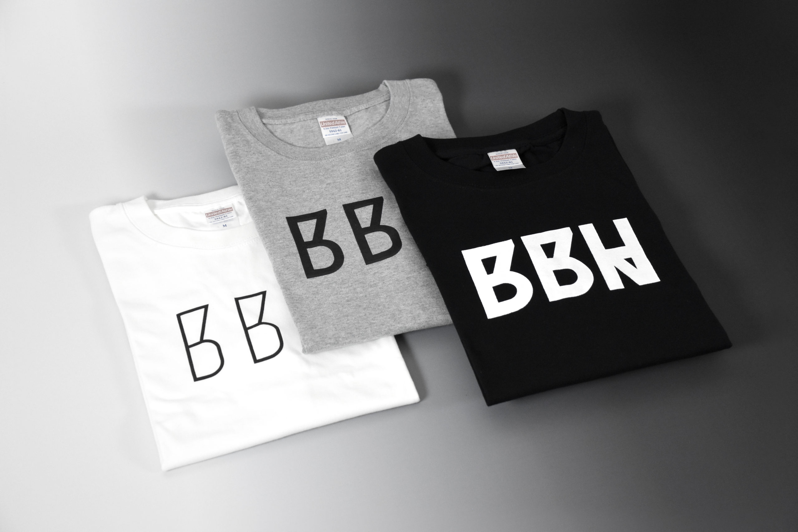
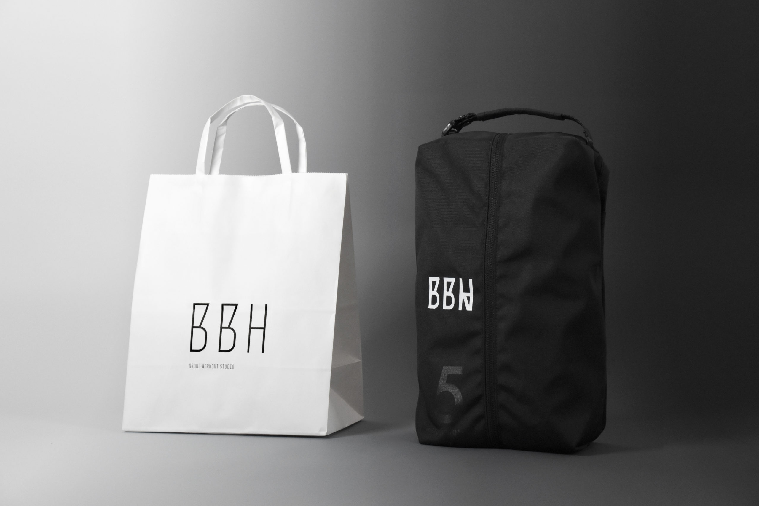
グループワークアウトスタジオ「BETTER BODIES HI」のVIとサインデザイン。コンセプトの「変わる」を表現するために3種のロゴタイプをデザインした。これらは共通の骨格を持ちながら太さと形が変化することで、同一性を保ちながら状況に応じた使い分けを可能にしている。日常生活の延長である受付では細い書体を控えめに、非日常的なワークアウトを行うエリアでは太く巨大な文字を用いている。これはマシンの識別記号だが激しい運動を行う利用者を鼓舞する効果もある。ロッカールームなどは日常と非日常の中間と位置づけ、中間の太さの書体を用いた。ひとつの施設であっても、それぞれの場所の機能は異なり利用者のテンションも違う。状況に応じて3種の書体を使い分けることで、日常と非日常をスムーズにつなぎ、ブランドアイデンティティの視覚化を実現した。
BETTER BODIES HI is a workout studio. Its goal is to change the bodies and lives of its users for the better by short, high-impact workouts. We needed to create an environment where users after work could gradually prepare their body and mind towards exercise. Therefore, we designed a typeface that transforms in three stages. As users move from the reception to the workout area, the typeface of the sign changes to a thicker and larger. The typeface gradually guides and encourages the user to work out. We used this typeface in logo, website, and products, to create a brand identity.